Source Statistics
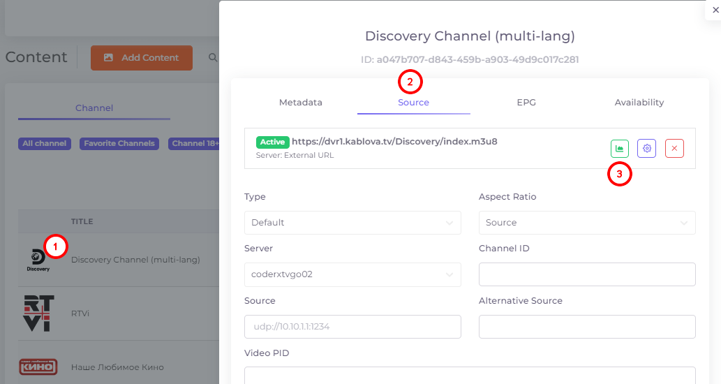
The source statistics can be accessed by clicking on the channel icon, then on the “Source” tab, and then on the statistics icon:
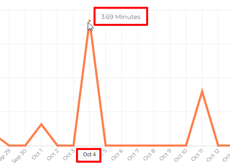
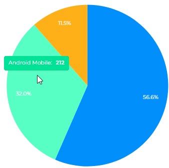
Statistics are presented as a line graph and as a pie chart to the right of that graph.
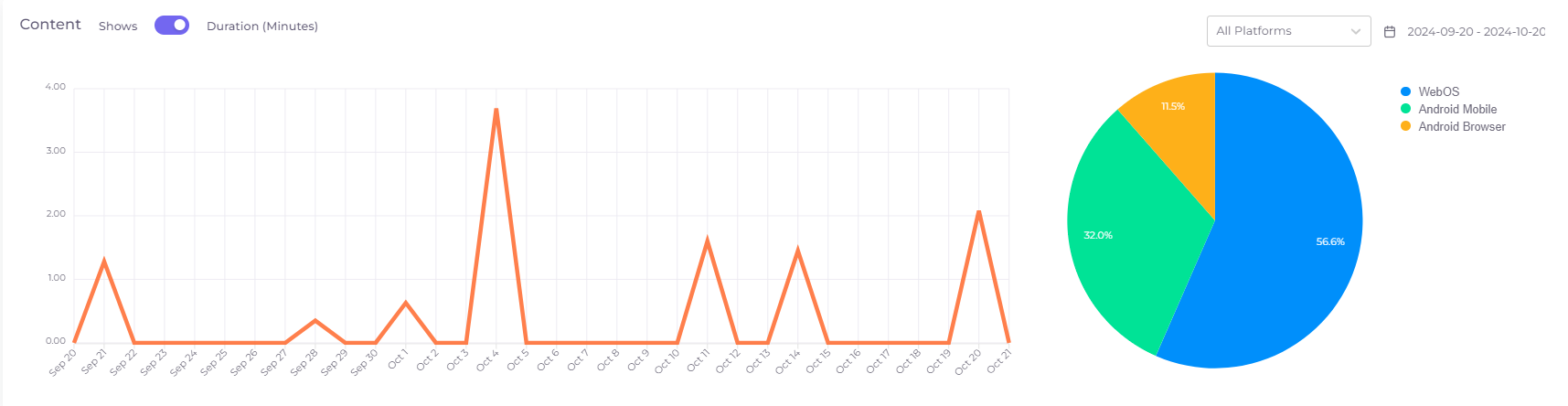
The line graph shows the channel viewing dynamics on a given source for the last month up to today in views or viewing duration depending on the selected mode.
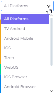
The pie chart shows the distribution of this data by platforms on which the Telebreeze application was used. In the upper right part of the statistics window there is a filter by platform, which allows you to see the viewing graph on a particular platform:
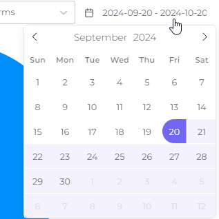
To the right of this filter is the period of report generation, it can be changed by clicking on it:
Hovering the cursor over a graph point or chart sector will show the exact value at the point/sector: